
Haiti Now
The Problem
Haiti Now’s current website lacks standard UX principles and modernness.
This can lead to a lack of credibility, a high bounce rate, and low donations.
Case Study Assets
Prototype


Phase 1: Design the Right Thing

“Looks like there is a consensus on these issues including the word “restavek”, the navigation, and donate button. It seems like we need to reorganize the content. ”
Overall Pain Points From User Feedback
Structuring the Process
I asked these “how might we” questions in the kickoff meeting that would help answer the problem areas and user pain points.
I had a lot of material to work with from user research, market and competitive research about charities, and internal Haiti Now material.
I structured HMW questions to keep myself aligned and come up with solutions based on the collected data and pain points.
Action Plan
-
User Opportunity: Users Get to Better Understand the Purpose of Haiti Now, Why What They Are Doing is Important, How They Can Help, and Experience a User Friendly Website.
Business Opportunity: Haiti Now Gets to Increase Their Donations, Bring Awareness to the Cause, Build the School and Own the Land, and Most of All Accomplish Their Mission in Helping the Girls Get Back on the Right Track.
-
The work I did intends to increase donations, provide users with the value of Haiti Now, and why the users are needed.
-
Since the research was extensive and involved various research methods. I chose to explain this project using the double diamond approach.
Phase 1: Design The Right Thing
Phase 2: Design Things Right
Weak Information Architecture (content is not engaging & causes cognitive overload)
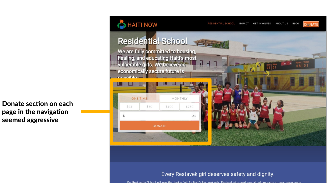
Donation Graphic on each multiple links is aggressive
Visual Design needs improvement with consistency, balance and scale, photos and graphics, white space, and hierarchy.

Enhancing Accessibility
Phase 2: Design the Things Right
Hi-Fi Mockups & More To Do
Background
Haiti Now is a non-profit organization dedicated to providing long-term solutions to house, educate, and empower Haiti’s most vulnerable girls who are denied schooling and instead work as unpaid domestic workers.
-
Haiti Now Has Great Content but Needs Improvement in Information Architecture, Storytelling, Visual Consistency, and Image Quality.
Each UX Designer (2 others) did a Heuristic Evaluation and combined on our findings to get the best quality of our findings.
Click Here to view my audit report
-
Based on feedback 3 user interviews and donor surveys. We saw many synchronicities between our audit and research feedback.
Click Here to see the full transcript of interviews.
Click Here for survey given to donors
-
The passion for the topic seems genuine
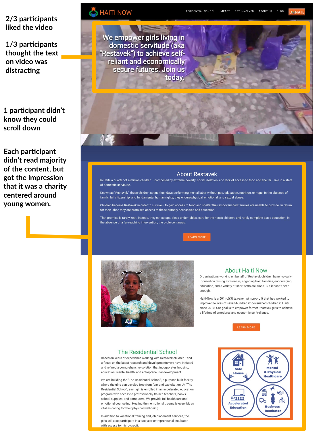
Users liked the video on the homepage showing the girls smiling and Haiti Now is doing the groundwork
The content shows what Haiti Now plans to do with the donations and why they need it
Since women are the most to suffer in improverish areas, users liked that the organization centers young girls
-
The text on top of the video can be distracting
Content is small & overwhelming
Donate on each page in navigation is aggressive
Confusing with Information Architecture in navigation.
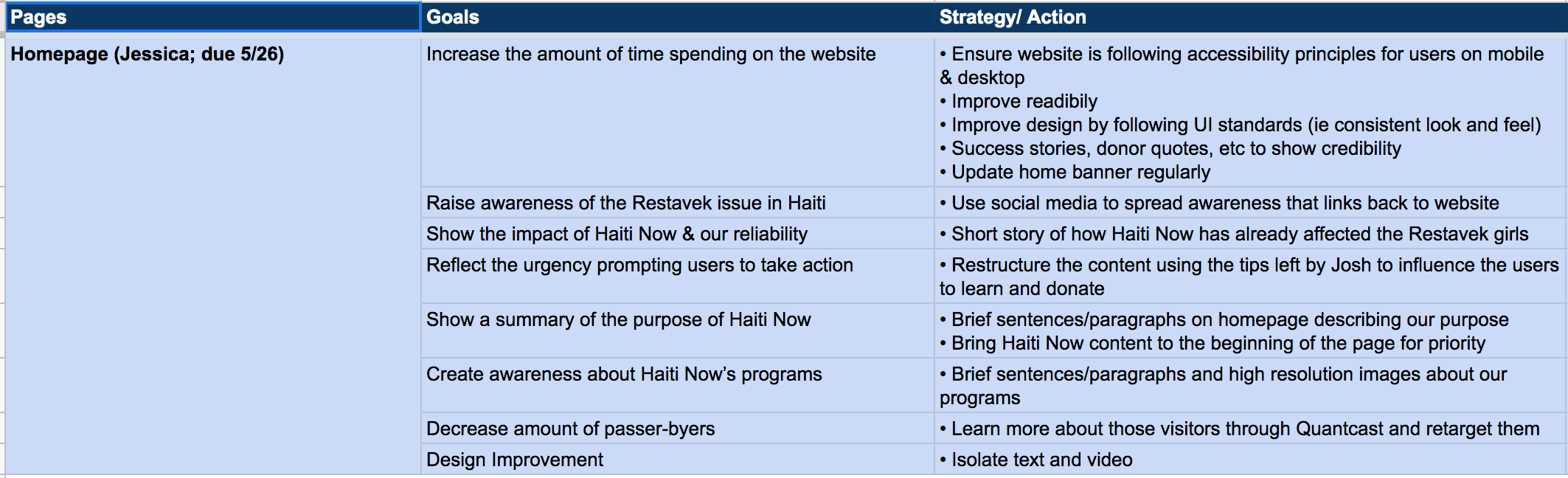
I then collaborated with project manager and stakeholders to identify the goals and strategies for each page.
Here is the strategy for the homepage which was applied to many other pages:
I designed a new site map that corresponds with language users can recall.
For example, the word restevak was in their navigation when it had the least amount of clicks, wasn’t in english, and most users didn’t know the meaning. So we changed it to “what is restavek?” and put it as a sub link under about us.

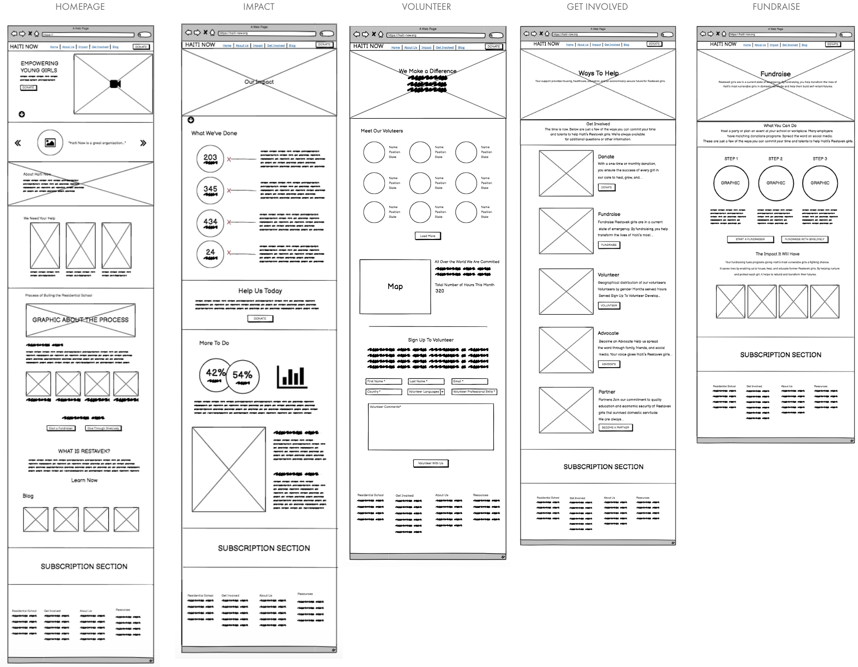
I created low-fidelity wireframe sketches of the homepage, impact page, and volunteer page. These sketches helped me think through the integration of the new layout before moving into digital renderings.
From Wireframes to Hi-fi Homepage Mockup


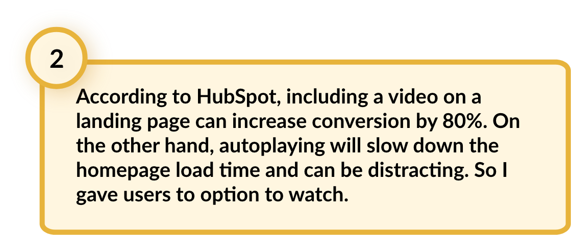


I adjusted the colors throughout the homepage so orange isn’t the dominating color, but instead the main color to call attention to donate.
This project is still a work in progress as engineers are getting ready to launch it soon. At that point I’ll be able to see the any bugs, support tickets, and feedback from users to improve their experience.

Lessons Learned
Get more team members involved.
Having more people involved in kickoff plans, workshops in the beginning could have helped tremendously to get a feel for what the team thinks the organization wants the users to feel, how to respond, and interactive with the website. Everyone wants to feel they’ve contributed to the growth of the org so giving them the opportunity to do that would have been great.
With that said, designing this project was meaningful because I’m Haitian, and being able to work on something that will benefit girls like me is a great opportunity.